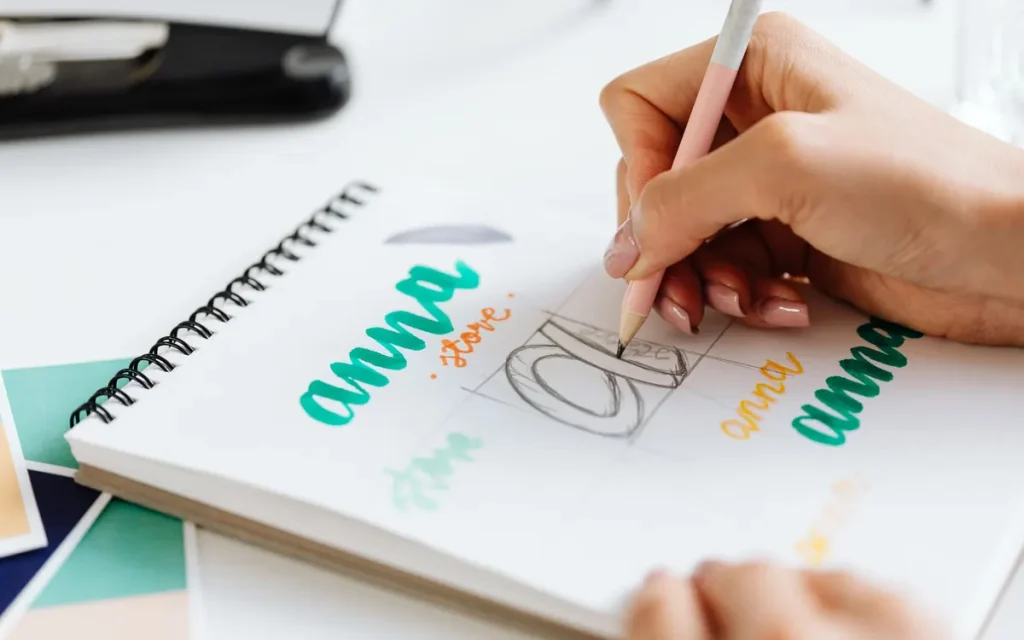

Despina and Aris opened a small artisan ice cream shop in Marousi. A friend designed the logo in an afternoon, the shop sign came out in a different shade of blue, Instagram followed a third look, and the cups arrived from the supplier in whatever font it had on hand. None of it was ugly; it just didn’t look like it belonged to the same business. That’s exactly what a well-designed brand identity solves: it gives every interaction a customer has with you the same recognizable “signature.”
For a new business, the goal isn’t to spend a fortune on branding, but to make the right decisions from the start. Below you’ll find what a brand actually includes, in what order to work on it, which mistakes to avoid and how to stay consistent as you grow.
At a glance
- A brand has three layers: what it stands for, how it looks and how it speaks.
- First you define purpose, audience and differentiation; the logo comes later.
- A simple brand guide keeps things consistent, no matter who creates the next piece of material.
- The look evolves along with the business, but the core recognition cues stay the same.
What does brand identity actually include?
Many owners of new businesses equate the brand with the logo. But the logo is only the most visible tip. Behind it are decisions about what you promise the customer, what style you have and what feeling you want to leave with anyone who encounters you, on the shelf, on their phone or at the register.
A practical way to look at it is in three layers, each supporting the next:
| Layer | What it includes | In the ice cream shop example |
|---|---|---|
| Strategic | Purpose, values, audience, differentiation | “Ice cream made with fresh milk from small producers, for the families in the neighborhood” |
| Visual | Logo, colors, fonts, photography, packaging | Pastel shades, rounded lettering, photos in natural light |
| Verbal | Tone, vocabulary, slogan, key messages | Warm, cheerful language, without exaggeration or borrowed foreign phrases |
When the three layers “agree,” customers remember you without trying. When they clash, for example premium prices with a sloppy look, a faint distrust sets in that shows up in your sales.
Why it matters from day one
- Trust: without a track record or reviews, customers judge by what they see, and a consistent look signals that you’re serious.
- Differentiation: a character of your own takes you out of being compared on price alone.
- Speed: with clear rules, every new flyer or post doesn’t start from zero.
The foundations: who you are, who you serve and who’s around you
Before you open any design software, set aside an afternoon with pen and paper. The answers here shape almost every choice that follows.
Your reason for being, in one sentence
Try to write in one sentence what you do, for whom and why it matters. Three questions help:
- What customer need or frustration do you solve better than others?
- What would you never do, even if it made you money?
- What do you want customers to say about you when you’re not in the room?
The values that come out of this need to be specific. Everyone writes “quality” and “reliability”; “we don’t serve anything we wouldn’t give our own kids” says something real.
One specific person instead of “everyone”
Describe the customer you want in detail: age, area, daily routine, what annoys them. A new dental practice in Glyfada aimed at families with young children will be set up very differently from one that focuses on cosmetic dentistry. Both are right, as long as you’ve made a choice. If you don’t have customers yet, talk to five or six people who fit the profile.
A look at the competition, without copying
Put the logos, colors and messages of five competitors side by side. You’ll usually see a pattern: everyone uses the same blue, everyone uses the same superlatives. That’s where your opportunity lies: not in looking like the most successful one, but in filling the gap they’ve all left.
From strategy to look: the visual elements
Now design makes sense: every visual decision has a “why” behind it, not just an “I like it.”
A logo that works everywhere
A good logo is simple and recognizable on a large sign as well as a tiny profile icon. Ask from the start for versions for light and dark backgrounds, a horizontal and a vertical layout, and a symbol that stands on its own.
Colors with specific roles
Choose one primary color, one or two secondary ones and a few neutral shades. Give each color a role: which one is for buttons, which for backgrounds, which for highlighted words. Also check that text on your colors is easy to read, especially on a phone screen.
Fonts that also work in Greek
Two fonts are enough: one for headings and one for body text. For a Greek business, there’s a trap that’s often overlooked: many beautiful fonts don’t have proper Greek characters or accents. Always test them with real Greek text before you finalize them.
Photos and icons with a shared style
Decide whether your photos will be bright or dramatic, with people or products only. For icons, keep the same line weight and the same style. This consistency is what sets a professional profile apart from a sloppy one.
Brand voice: how you speak, not just what you say
Identity isn’t only visual. The way you write a post, an email or a reply to a review is just as distinctive as your logo. Here are two versions of the same announcement:
- Neutral: “We would like to inform our customers that a new flavor will be available from Monday.”
- With character: “Starting Monday: Aegina pistachio with a hint of salt. Come tell us if we nailed the recipe.”
The second one sounds like real people. Write down three adjectives that describe your voice (e.g. warm, direct, witty) and, next to them, what it isn’t (e.g. not sarcastic). Round it out with a short slogan and a sentence that explains your value.
You’ll need this voice everywhere: on your website, on social media, in your newsletter. To see how it stays consistent in everyday communication, check out our guide to a social media strategy that delivers and our article on the role of content marketing in building brand authority.
The brand guide and the mistakes it saves you from
All of the decisions above are recorded in one document, known as a brand book or brand guidelines. A few pages are enough, as long as they answer the questions of the next designer, printer or new employee.
- Logo: versions, minimum size, clear space around it and examples of incorrect use.
- Colors: HEX and RGB codes for screens, CMYK and, if needed, Pantone for print.
- Typography: which font goes where and at what sizes.
- Voice: the adjectives, your preferred words and two or three sample texts.
- Imagery: photo style, icons, examples of posts and printed materials.
Keep your logo files in vector format in a shared folder, so you’re not digging for a blurry file in old emails when you’re in a hurry.
Common mistakes new businesses make
- They start with the logo. Without a strategy, the choice is based on the taste of the moment and changes with the first comment.
- They copy the market leader. They end up as a weaker version of it, instead of a real alternative.
- They chase trends. What impresses today can look dated in a few years.
- They forget mobile and print. A logo with thin lines can get lost on screen or fail to come out cleanly in embroidery or on a stamp.
- They don’t stay consistent. Even the most polished work won’t help if every piece of material “interprets” it differently.
Consistency also applies to your digital storefront. A website that works flawlessly on mobile is a key part of your image, as we explain in our article on the mobile-friendly website.
How does a brand evolve without losing what it has built?
No brand identity stays the same forever. The business adds services, opens a second store or finds a new audience, and that’s healthy.
The secret is to separate what changes from what stays. Your primary color, your symbol and your core tone are the recognition cues your customers have learned. These you refresh gradually; photos, secondary graphics and campaigns are updated more often.
A brand is like a face: it changes haircuts and clothes over the years, but your friends recognize it instantly.
Once a year, spread everything you’ve printed out on a table and open your site and social profiles next to it. Whatever strays from the guide, fix it.
How FoxWeb can help
At FoxWeb we design identities that start with strategy and reach all the way to the last business card and e-shop page. Through our branding and graphic design services, we make sure your business has one clear image at every touchpoint.
Strategy and logo
Together with you, we clarify your audience and differentiation and design a logo that works at every size.
Brand guide and files
We deliver a practical brand book and all the files you’ll need for screen and print.
Applied everywhere
From printed materials and printing to your website and social media, your brand stays consistent.
Frequently asked questions
What’s the difference between a logo and a brand identity?
The logo is one element of the identity. The identity also includes colors, fonts, photographic style, tone of communication and the rules that tie them together. A logo without that framework will struggle to stay consistent.
How long does it take to build a brand?
Designing the core elements can be completed in a few weeks, depending on the rounds of revisions. Recognition, however, is built over time, through a consistent presence at every customer touchpoint.
Should I register my name and logo as a trademark?
Trademark registration protects your name and logo from being copied and is usually worth it for businesses that plan to grow. Before making your final choice, check that a similar trademark doesn’t already exist in your industry. For the process itself, consult a lawyer experienced in trademarks.
Conclusion
Brand identity is one of a new business’s first investments that keeps paying off for years. Start with your purpose and your audience, translate them into a look and a voice, write down the rules and stay consistent.
The result isn’t just a nice-looking logo, but a business that customers recognize and remember.
Launching a new business or want to bring order to the image of an existing one? Contact FoxWeb or call us at +30 210 300 57 57 for a first conversation.