A physical therapist in Peristeri opened her practice with a logo she made in one evening using a free online tool. Three years later, as she prepares to open a second location, she discovers that the design blurs on the sign, can’t be embroidered on uniforms, and looks a little too much like a well-known sportswear brand. That’s when she realizes logo design was never a first-day detail.
Your logo accompanies your business at every point of contact with the public: on your website, on social media, on business cards, on packaging, in your storefront. Below, we explain what makes a logo work, how a sound design process unfolds, which files you should receive, and why the rushed option usually ends up costing more.
At a glance
- Your logo is often the first impression a customer forms of you and the thing they recognize you by.
- A good logo is simple, legible at any size, works in a single color, and doesn’t chase trends.
- Changing your logo later means new print materials, signage, packaging, and lost brand recognition.
- Always ask for vector files and the core variations.
Why is logo design a strategic decision?
When you start a business, your attention naturally goes to the product, the premises, the first customers. The logo feels like something that will “come together along the way.” In reality, it’s one of the few assets that will work for you every single day, for many years.
A prospective customer may not have read a word about you yet, but just by seeing your mark they already form an impression: serious or sloppy, modern or dated, premium or budget. A logo works like a handshake; it won’t close the deal on its own, but it sets the tone of the conversation.
What makes a logo work
Aesthetics matter, but they aren’t enough. An effective logo meets a few practical criteria that are often overlooked.
Simplicity and recognizability
People see your logo for a second, often from a distance or on a small screen. A few clean elements stick in the memory; lots of detail gets lost.
Flexibility across every size and medium
The same mark has to read clearly as a tiny browser icon, as an Instagram profile picture, on a pen, and on a two-meter sign. It also has to work in a single shade, for stamps, embroidery, or engraving.
Relevance to your audience
A pastry shop in Chalandri and an accounting firm speak to different audiences with different expectations. Typeface, colors, and style need to “speak” to the people you want to attract.
Uniqueness
A mark that resembles a competitor’s makes you invisible at best and lands you in an awkward position at worst. Off-the-shelf templates and generic icons are a common cause of lookalike logos.
How professional logo design unfolds
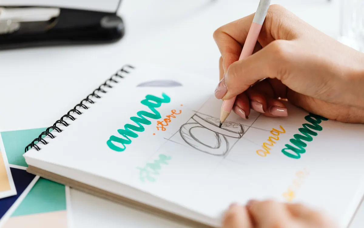
An experienced designer doesn’t start with sketches but with questions. A typical process includes the following stages:
- Discovery and brief: what you do, who you serve, how you want to be seen, what sets you apart.
- Research: a look at your industry and competitors to find room for you to stand out.
- Initial concepts: different directions, shown in real-world applications and not just on a white background.
- Refinement: improvements to the direction you chose, tested at small and large sizes.
- Delivery: final files, variations, and a short usage guide.
A logo is the starting point of a broader visual language. To see how it extends into colors, typefaces, and style, read our article on corporate identity, and if you’re just getting started, our guide to brand identity for new businesses is a useful read too.
Which files should you receive?
Many businesses only have a JPG of their logo and struggle every time they need a sign or a printed piece. Ask for a complete package from the start:
| File or asset | Where you need it |
|---|---|
| Vector (SVG, AI, or EPS) | Print shops, signage, embroidery, any enlargement without loss of quality |
| PNG with transparent background | Website, presentations, social media |
| High-resolution PDF | Printing and sharing with partners |
| Variations: horizontal, stacked, symbol only | Different spaces, such as a favicon or profile picture |
| Color codes (HEX, RGB, CMYK) | Accurate reproduction on screen and on paper |
The hidden cost of the quick fix
A logo can be made in a few days, but it shapes your image for decades. When the business grows and the makeshift mark no longer matches its level, the change isn’t limited to a new design.
- New signs, storefront graphics, and vehicle wraps.
- Reprinting business cards, catalogs, invoices, and packaging.
- Updating your website, social media profiles, and ads.
- Time until customers connect the new look with the business they already know.
The total often far exceeds what the right investment would have cost from the start. What’s more, an inconsistent image also affects how people perceive you online, a topic we touch on in our article on online reputation management.
You don’t pay for a logo once; you pay for it every time someone sees it and forms an opinion about you.
Trendy or timeless?
Design trends move fast: color gradients, particular typefaces, minimalist marks that all look alike. It’s easy to get swept up in whatever looks fresh today.
A good test is to ask yourself whether the logo will still look right in ten or fifteen years. A mark can be subtly refreshed over time, but its foundation has to last. That’s why logo design takes experience and strategic thinking, not just a good eye.
How FoxWeb can help
At FoxWeb 360 Digital Agency, we treat every logo as part of the overall brand, not as a standalone graphic design job. Our goal is a mark that accurately conveys your quality, your philosophy, and your ambitions.
Strategy before design
We start with your goals and your audience, so every choice has a reason to exist.
End-to-end branding
Through our Branding & Graphic Design services, your logo extends into colors, typography, and real-world applications.
From screen to paper
We also handle printing, so your image stays the same across every material.
Frequently asked questions
How long does logo design take?
It depends on the complexity and how quickly you send feedback. Typically, the process from brief to final files takes a few weeks. Time spent on research and testing isn’t a delay; it’s what makes the result last.
Can I make a logo with AI or an online tool?
These tools help you explore ideas, but they rarely produce a unique, technically sound mark that’s ready for every use. There’s also the risk of resembling existing trademarks. For a business with long-term goals, professional design is the safer choice.
Should I register my logo as a trademark?
Registering it as a trademark protects your business from copies and confusion, especially if you plan to expand. Before making a final choice, it’s worth checking for similar marks. For the process and the details, it’s best to consult a lawyer.
What’s the difference between a logo and a corporate identity?
The logo is the mark people recognize you by. Corporate identity is the whole system: colors, typefaces, imagery and communication style, applications across print and digital media. The logo is its heart, but not the entire identity.
Conclusion
Logo design is a small investment of time with a very long-lasting impact. A mark that is simple, flexible, unique, and designed with an eye on the future will represent you well at every stage of your growth.
Just as every business needs solid foundations, its image deserves to start off right. Because in the end, a logo isn’t just a design; it’s your signature.
Launching a new business or thinking about a brand refresh? Contact FoxWeb to talk about the logo your business deserves.